
Landing pages are valuable tools for lead generation, helping you to capture the contact details of endless potential customers.
However, to ensure you’re getting the best results from your landing pages, you need a few crucial things: a great page design, exceptional copy, and an eye-catching call to action button. The “CTA button” in particular, can make or break your chances of success.
Although it might seem like a small component of your page overall, if your button isn’t effective enough to earn clicks, then your landing page might as well not exist.
So how do you design a conversion-boosting call to action button? Read on for our top tips.
6 Tips for a Powerful Call to Action Button
A call to action button is essentially a small clickable component on a website page that pushes a customer to the next stage in their buying journey. A CTA might ask someone to buy a product, learn more about something, or book an appointment.
While it is possible to use text as a “Call to Action”, buttons usually do a much better job at grabbing people’s attention. However, just like any other element of your landing page, it needs the right design to deliver the best outcomes.
Here are our top tips for better CTA buttons.
1. Choose One Primary CTA Button
It’s often tempting to give your visitors options when they arrive on a landing page. After all, not everyone who arrives on your page will be ready to make a purchase or book an appointment straight away. That’s why some businesses try to avoid losing conversions by giving customers the option to click a button to learn more about a product, or view a different version of an item.
However, too many options can confuse and overwhelm your customers. Decision fatigue is a real thing, and giving users too many choices can mean they end up doing nothing at all.
While you can always include different links on your landing page, you should only have one primary CTA button, preferably placed at the top of the page, or “above the fold”, so customers don’t have to scroll to find out what they should do next.
This CTA should match the overall intent of your landing page. In other words, if you create a landing page to advertise an upcoming webinar, the button should say something like “Reserve my spot”, or “Sign up”.
2. Use an Eye-Catching Colour and Shape
There was a time when most companies assumed the best colour to use for a call to action button was red. Red is one of the most eye-catching colours, and it contrasts well with the white background on most websites. However, red isn’t the only colour to consider.
The right colour for your CTA button will depend on a few things, such as your branding, colour contrast on your website, and what appeals to your target audience.
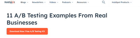
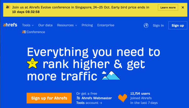
For instance, here’s an example of a CTA button from HubSpot that effectively stands out from the rest of the content on the page, while still drawing attention to HubSpot’s brand identity:
Remember, while there’s no one-size-fits-all strategy to choosing the right colour, you should always ensure your CTA buttons are immediately visible, and contrast with the rest of your page.
As well as considering colour, you might want to think about shapes too. Rounded shapes can be more inviting than blocky squares and rectangles.
3. Get the Wording Right
Typically, it’s the words on your CTA buttons that ultimately determine whether someone will actually click them.
Again, there’s no exact science to choosing the right wording for lead generation, but it’s usually a good idea to keep your statement simple and straight to the point (don’t use too many words).
Secondly, it’s important to focus on Action words. After all, this is a “Call to Action”, meaning you want to encourage users to do something. Phrases like “Claim your place” or “Get my free eBook” instantly let the customer know what they’re going to get out of clicking your button.
Here are some other quick tips to keep in mind when you’re playing with wording:
- Be straightforward: Use simple terms in your CTA buttons. Poetic language and jargon might sound good to you, but it’s more likely to confuse your customers.
- Go with first person phrasing: First person language is more likely to connect with your target audience on an emotional level. The phrase “Get my eBook” for instance, suggests that customers who don’t click your link are giving something up.
- Create urgency: While your CTA language shouldn’t be too aggressive, it should inspire customers to do something straight away. Phrases like “Act Now”, or “Limited Time” can generate a “Fear of missing out” or FOMO in your customers.
4. Make your Call to Action Button Stand Out
We’ve already discussed the importance of choosing the right colour for your call-to-action button, but there’s more to making your CTA stand out than just using the best colour palette. Aside from using eye-catching shades that contrast with the rest of your page, and the right shape, you should also experiment with other ways to grab attention, such as:
- Font choices: Though the typography on your CTA button should generally match the style on the rest of your website, you can still experiment with ways to make it more eye-catching. Try using a slightly larger font size, bolding the font, or using capital letters.
- Interactivity: All CTA buttons are technically interactive, but you can experiment with design elements to further encourage customers to click your button. Hover effects, that show the button changing slightly as a mouse moves over it are great for boosting engagement.
- White space: A great Call to Action Button shouldn’t be overwhelmed by too much surrounding content. Having plenty of white space around the button makes it less likely customers will miss your button when they’re browsing through your page.
Additionally, remember to position your button where users will see it immediately. As mentioned above, the best position is usually at the top of the fold, next to an image or a small amount of text that tells customers about the benefits of whatever you’re offering.

5. Prioritise the User Experience
Every website page you create, from your home page, to your landing page, should be designed with a focus on user experience. Giving your customers a great experience on your website is how you show them that you’re committed to putting their needs first. That means they’re more likely to want to further interact with your brand, buy your products, or invest in your services.
There are various ways you can improve the customer experience with your call to action button. One simple, and obvious option is to ensure your button and landing page are optimised for mobile users. Make sure it’s easy for users leveraging a small screen to tap the button without any issues.
Think about how you can make it easier for customers to make decisions too. For instance, including social proof on the landing page around your button can provide customers with valuable insights into the benefits of whatever your offering, streamlining their purchasing journey.
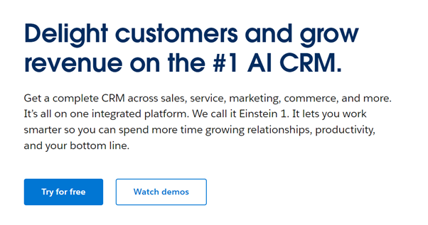
Including an obvious benefit in your button copy can be helpful too. For instance, Salesforce reassures customers that they won’t have to pay anything to trial its software:
6. A/B Test and Optimise your Call to Action Button
Finally, it’s worth remembering that the best strategy for a conversion-boosting call to action button can vary from one company to the next. The only way to ensure you’re getting the best results from your button, is to put it to the test.
A/B testing is an excellent way to determine the effectiveness of your call to action. All you need to do is create two identical versions of your landing page, and change one element about your CTA button, such as the colour, shape, text, placement, or surrounding imagery.
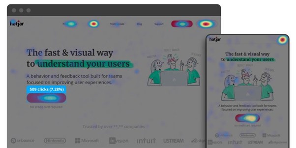
Monitor the results achieved with each version of your button, using tools like Google Analytics to track click-through and conversion rates. You can even use specialist software to create heatmaps, that show you how much time users spend on each portion of your landing page.
Boost the Results of your Call to Action Buttons
Your call to action button is one of the most important elements of any landing page. If it’s not capturing attention and driving customers to interact with your website, then you’re missing out on endless potential leads.
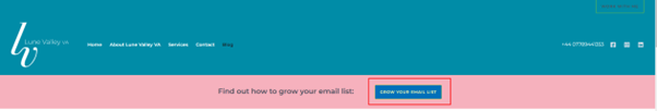
Use the tips above to optimise your call to action buttons, and make sure you check out our free guide on how to grow your email list and enhance your lead generation strategies.
If you need extra help improving your website’s performance, creating amazing content, or boosting conversion rates, get in touch by emailing me at info@lunevalleyva.co.uk.